The hidden skill behind every great tattoo: Composition
Composition (or the way visual elements are arranged) is the backbone of any artwork - including mine. I’ve been doing large-scale colour realism for years now, and I keep coming back to the same thing: a tattoo can have perfect technique and beautiful colour, but if the composition isn’t right, it just won’t land.
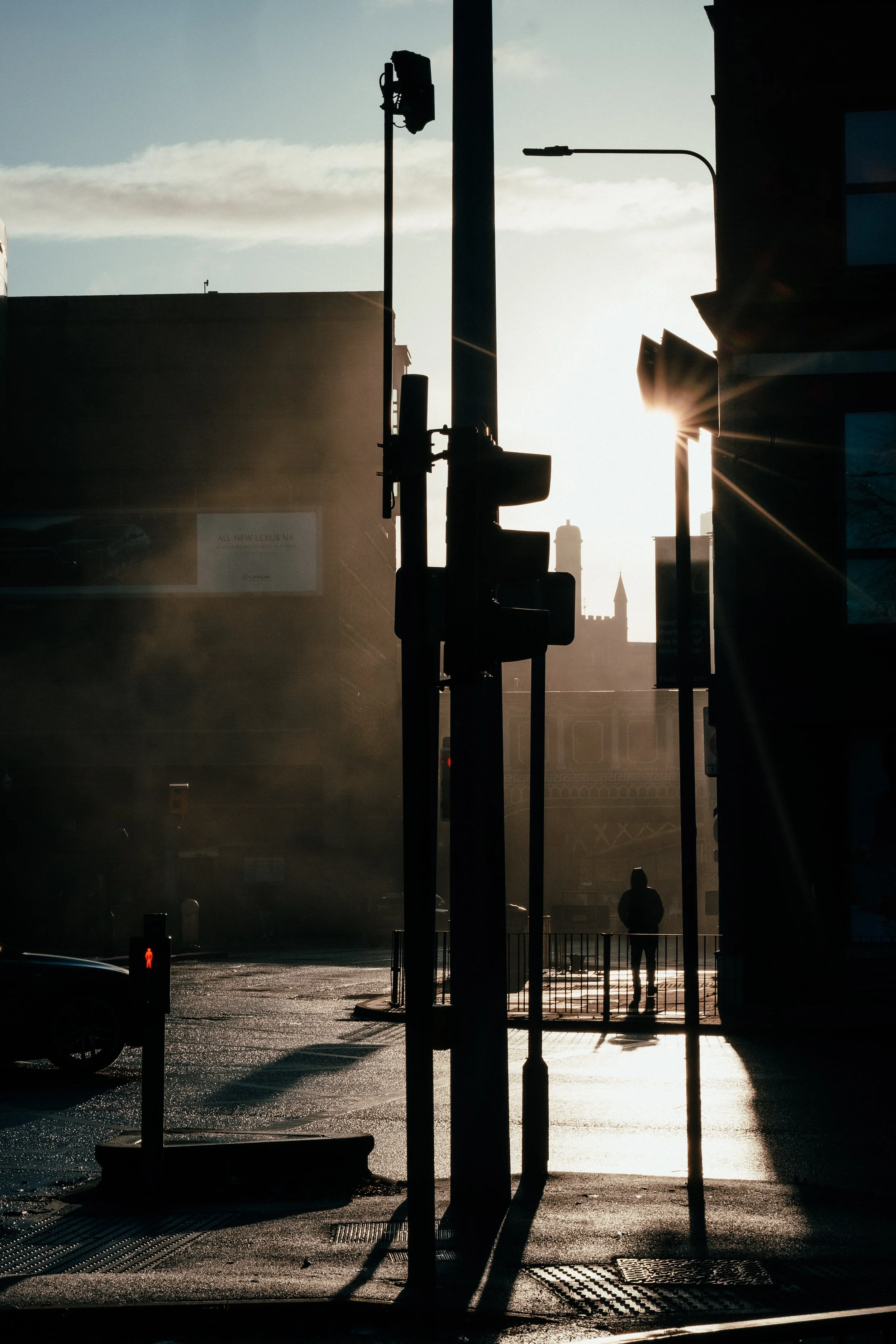
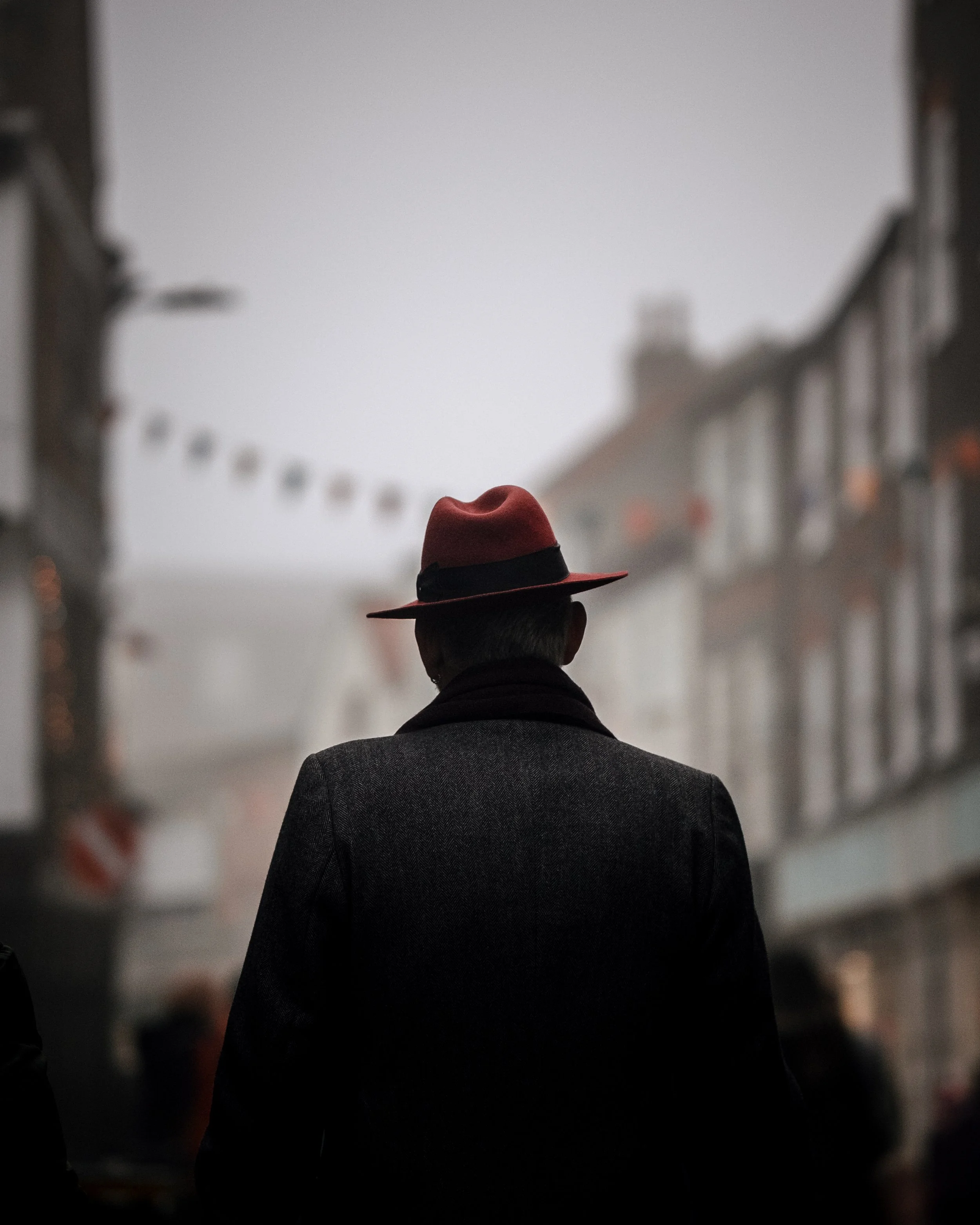
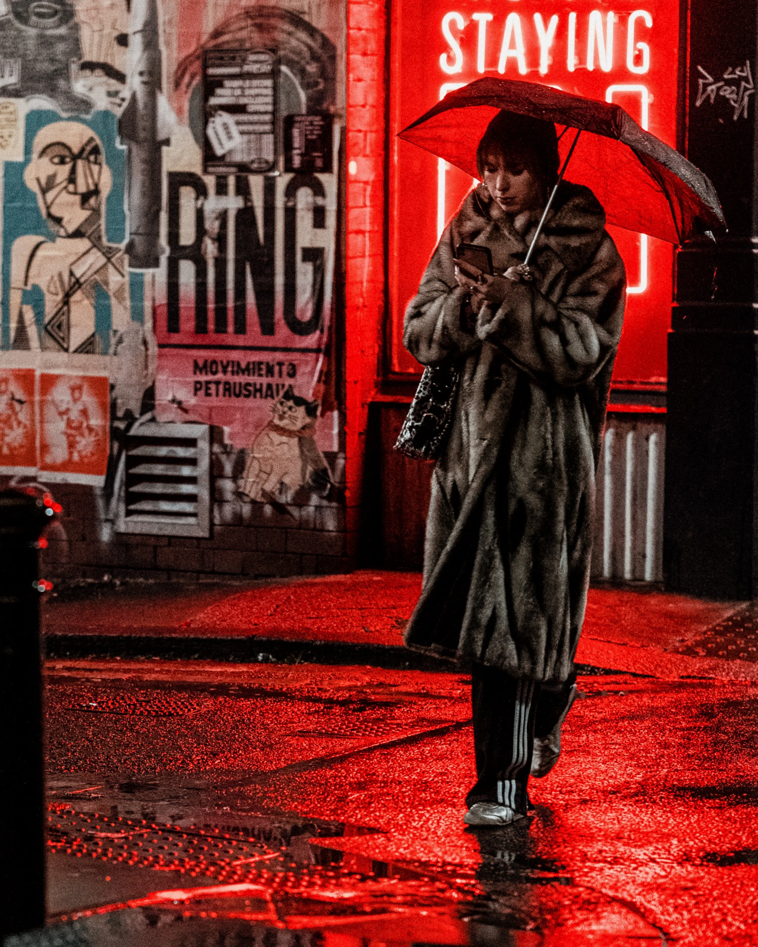
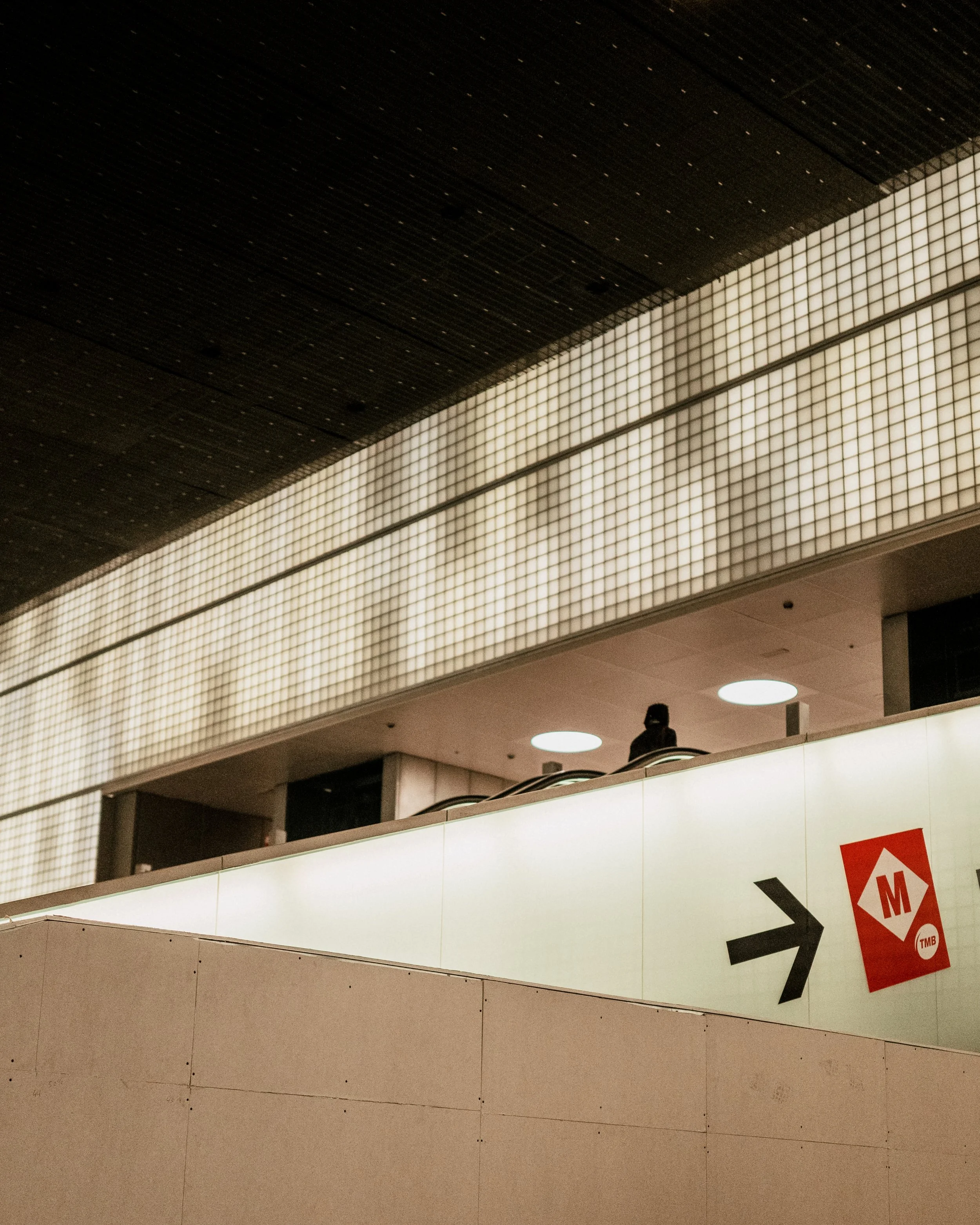
Composition is the quiet decision-making behind every successful piece - where the eye lands first, how shapes sit against the body, and how colour and flow either support or fight the image. I pick up a lot of those instincts from photography; a quick street frame can teach me more about balance, tone, and flow than an hour of pencilling ever will.
When I design a tattoo, I start by thinking about visual hierarchy - what you should notice first, second, and so on. If the main subject and the background have the same size or intensity, they’ll fight for attention. So I make the main subject (a portrait, an animal, a face) slightly larger or more contrasting, and let supporting details fill the rest of the space.
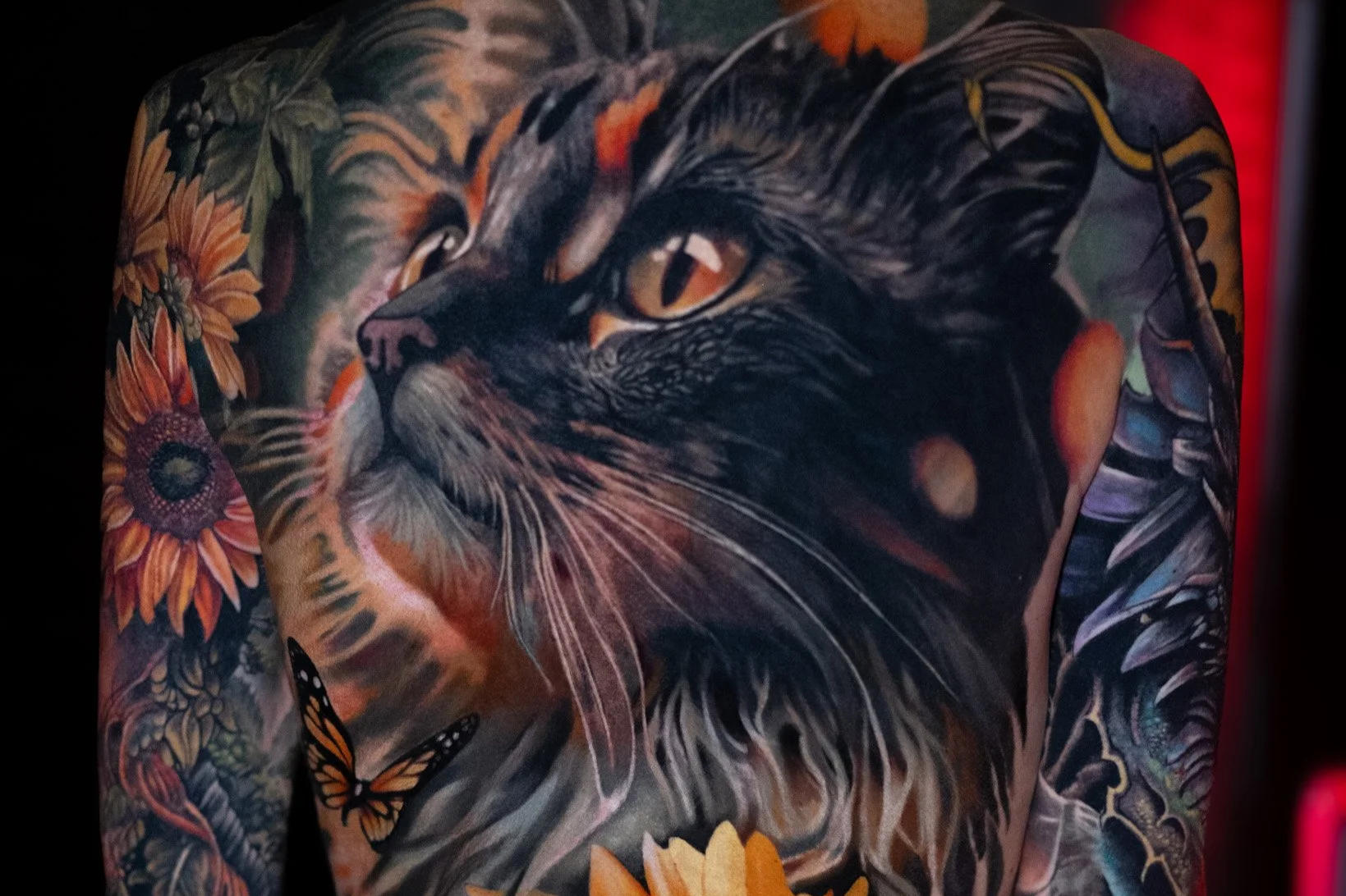
In full-colour realism, I plan shapes and transitions carefully so the design stays readable and balanced as it settles and the colours blend into the skin. A well-balanced layout distributes elements so no area feels too empty or too crowded. I use basic layout rules - rule of thirds, leading lines, sometimes even the golden ratio - to plan where things sit. Contrast, in value or colour, reinforces hierarchy: stronger contrast pulls the eye in, while softer tones let background elements sit back.
In short, composition is about arranging shapes, colour, and placement so the main image pops and everything else supports it.

Photography sharpened my tattoo eye.
It taught me to think in frames. I started taking street photos seriously a few years ago, and the lessons carried straight over to tattoo layouts. In photos, you decide where the subject goes, which elements guide the eye, and how subtle contrasts create focus. I use the same thinking when planning a large-scale colour tattoo.

In full-colour realism, I rely on variations in tone, colour, and soft transitions to make the main subject stand out. Gentle shifts in colour and form lead the viewer naturally through the piece, much like subtle contrasts or lines in a photograph. Shooting in Manchester streets taught me to notice silhouettes, highlights, and how the eye moves through a scene. Every photo I frame helps me practice composition for backs, sleeves, and large colour pieces. You can see examples on my Instagram, where tone and subtle form guide the eye without obvious outlines.
When you look at a tattoo, here’s what I check:
Visual hierarchy / focal point: The most important element should be dominant - larger, sharper, or higher contrast.
Strong silhouette: Shapes should read clearly from a distance. If you can’t tell what they are at a glance, the composition might need work.
Contrast: Stronger contrast should sit where you want the eye to land, with softer tones for background or filler.
Balance and flow: Elements should guide the eye through the design naturally. Nothing should feel jammed into a corner unless that’s intentional.
These are the same things I consider when sketching and again during stencil placement.
Why this matters for you as a client?
I can spend hours on technique and colour, but none of that matters if the composition is weak. Good composition makes a tattoo feel intentional and timeless. It keeps a design legible for years and turns a collection of beautiful elements into a cohesive piece that works with the body.
If you’re planning a large-scale colour piece, we’ll think about composition from the start - it’s never an afterthought. Bring references, tell me what you want people to notice first, and trust me to use colour, tone, and subtle transitions to make the design flow and really pop.
If you want, I can look at three images you like (photos or tattoo references) and show how I’d combine them into a single composition for a back piece or sleeve. Check out my Instagram for examples and message me if you want to talk through ideas.
Thanks for reading - I’ll keep sharing behind-the-scenes bits as I go.
Tibor